NMCWatch – brand overhaul + strategy

NMCWatch – brand overhaul + strategy

Branding design + website + podcast + comms, marketing & learning strategies

NMCWatch approached me to help them with their comms and marketing. As with other non-profits I’ve worked with, it was a good time in their development for a brand overhaul. Creating a fit-for-purpose presence makes all future work around comms, marketing, recruitment and fundraising much easier. So it is an important decision to make early in a new working relationship.

Clear messaging is central to rebranding any organisation. Once the key elements are set, other activities adopt a natural order.

One of the bigger comms challenges for NMCWatch is anonymity. Their work is often with very traumatised people, so developing a visual language that didn’t rely on a lot of photography and video was important.

Developing a stronger tone of voice, clarifying what they do, how they do it and enabling their very niche audience, was essential too. They had a lot of content so I re-ordered this and improved their SEO, reinforcing their thought-leadership role.

So far, I have created a logo refresh, a new website involving a thorough UX deep-dive, research into NMCWatch online forums, copywriting, illustrations, and WordPress build.

I have also been producing a podcast for NMCWatch, and am helping them strategise internal training and learning projects.

Online course content

Online course content

Online course content

When NMCWatch approached me it was a good time in their development for a brand refresh. As with others I have helped, creating a presence reflective of the organisation was key to giving their future communications and fundraising a solid base.


Clear messaging is central to rebranding any organisation. Once the key elements are set, other activities adopt a natural order.

Julien Truffaut is a leading Scala web developer. In 2020 he asked for my help to create a complete online course teaching Functional Programming. The process took nearly two years.

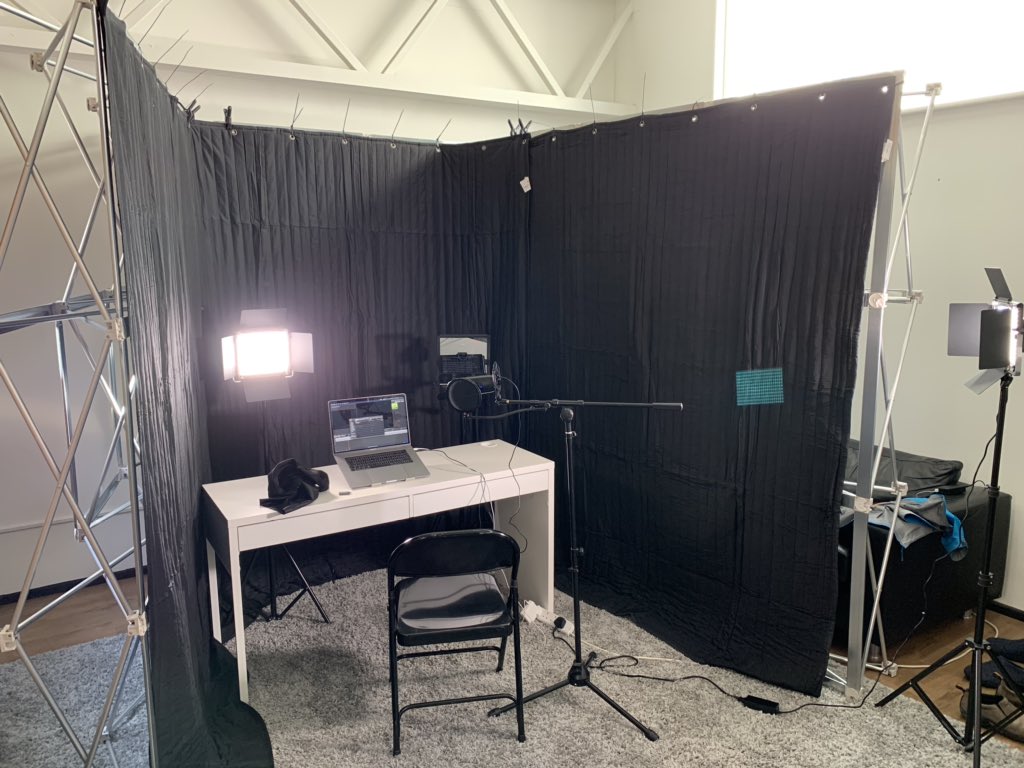
At first, I helped Julien set up his studio so that he could self-shoot all the content for his course. I compiled a list of equipment he needed – camera, lights, autocue, microphone, soundproofing – and a comprehensive series of plans, diagrams and settings to show him how to record high-quality videos that both sounded and looked professionally produced.

I then produced all 50+ videos for the course, from Julien’s recordings, creating dynamic edits that reflected his high-quality content. I also expanded his course branding so that it worked for moving image – transitions, split-screen, picture-in-picture, animated logo and end screens. The videos below show how this evolved over time to create an intuitive learning experience for his subscribers.

With my creative direction and post-production experience, I was able to bring some extra magic to Julien’s highly detailed approach and leave him very happy with end result.

“It was awesome. I don’t think I would have managed without James. There is so much to learn, it can be overwhelming, but he has always been here to help me with all the challenges I faced. We found a very efficient workflow and I am really happy about the results.”

Watch Julien’s full testimonial.

One of the big communications challenges for NMCWatch is anonymity, so developing a visual language that didn’t rely on photography and video featuring their cohort was important.

I focussed on developing a stronger tone of voice to clarify what they do, how they do it, and to support their very niche audience. This involved re-ordering their existing content, and improving SEO while reinforcing their thought-leadership role.

Primary palette

Midnight blue

Mid blue

Orange

Warm grey

Secondary palette

Midnight green

Light blue

Gold

Lemon

Text black

So far, I have redesigned their visual brand elements and created a new website involving a thorough UX deep-dive, copywriting, illustrations, and WordPress build.

I also produce a podcast for NMCWatch and am helping them strategise internal training and learning projects.

Kennedy Street Recovery

Kennedy Street Recovery

Rebrand + online + podcast + films

A comprehensive rebrand to lift this important charity’s presence and help it build for the future.

I got to know Kennedy Street during lockdown, helping them with live-streaming. It was obvious that their brand at that time didn’t fit with the charity’s personality or future plans.

I started from scratch, researching their current volunteers and supporters to understand the organisation and recovery world better.

Calling on the background of co-founder, ex-Coronation Street actor Kevin Kennedy (that had already influenced their name),  I devised a striking, clear logo that immediately tells us who they are and their role as a signposting organisation for people looking for addiction recovery.

Now, while a logo is often the visual starting point of a rebrand, other elements and activities have increasing importance for any online presence.

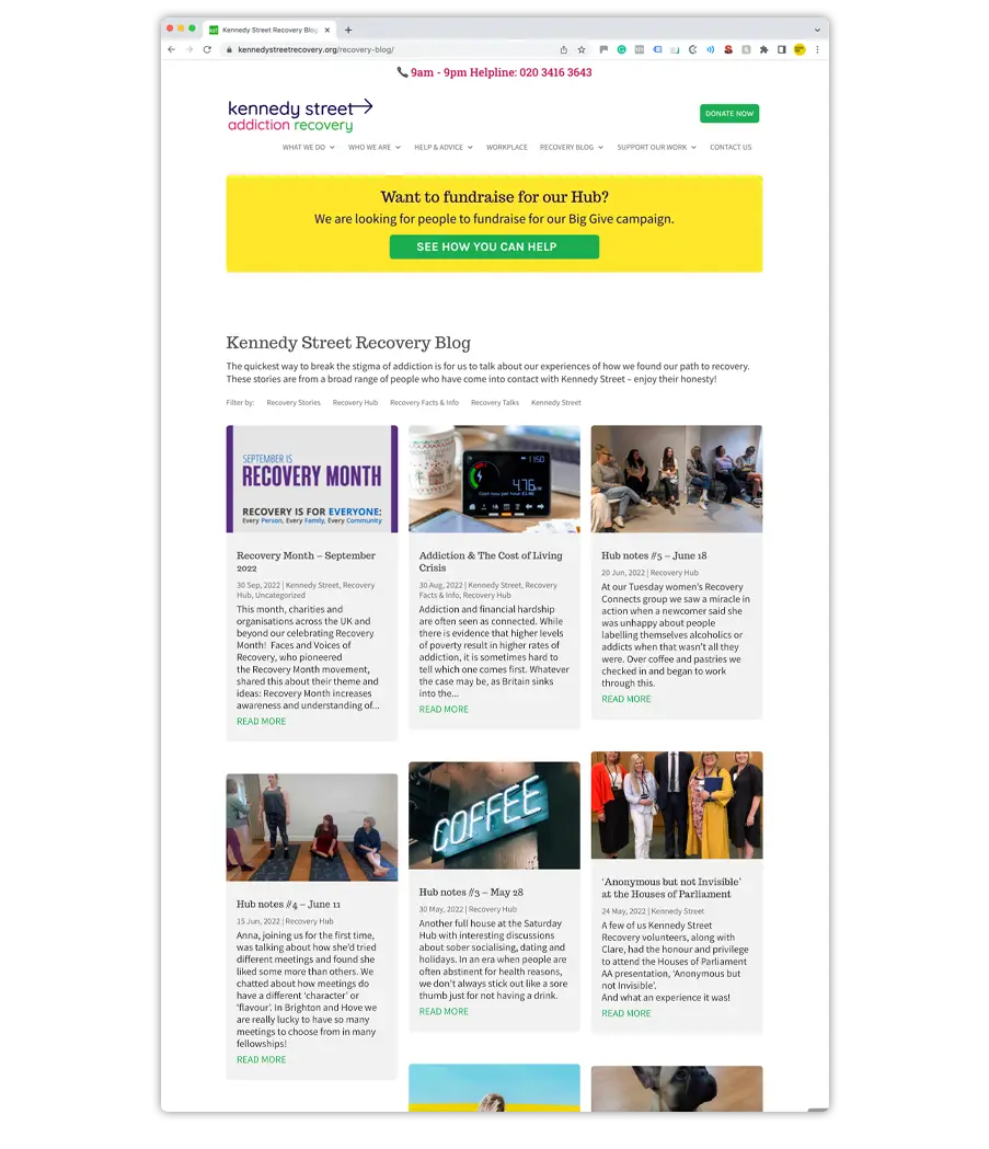
Alongside the website, I developed a mindset across the charity to encourage more online social engagement that the lockdown, live-streamed chatshow had started. So a busier blog, a podcast, original promo films (scroll down to watch) and video content clipped from chatshow guests.

This work better defined the charity, helping it to get better funded which enabled it to open its first physical recovery hub in central Brighton.

‘Behind Closed Doors’

‘Behind Closed Doors’

‘Behind Closed Doors’ was a collaboration between three photographers (Ursula Kelly, Huw Nicholls and James Lane), a graphic designer (John Reeves) and an academic (Jon May, Queen Mary University of London) on behalf of End Hunger UK. The exhibition explored the nature and scale of food insecurity unfolding in Britain today and shares some of the experiences of those living through this crisis.

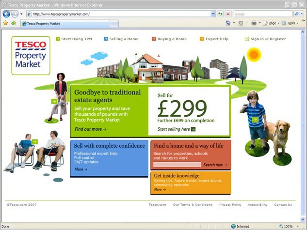
Tesco Property Market

Tesco Property Market

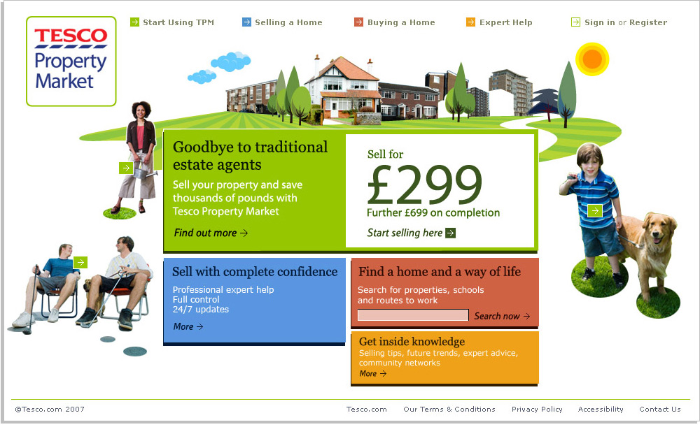
I defined and developed a new Tesco sub-brand for this project.

Leading a small design team within the SCRUM development environment, I guided the overall creative direction, interface design and marketing communications for the initial launch across all channels.

The design process involved working closely with senior stakeholders, business analysts and development teams for front and back-end integrations (ASP.net, XHTML, CSS, jQuery, etc).

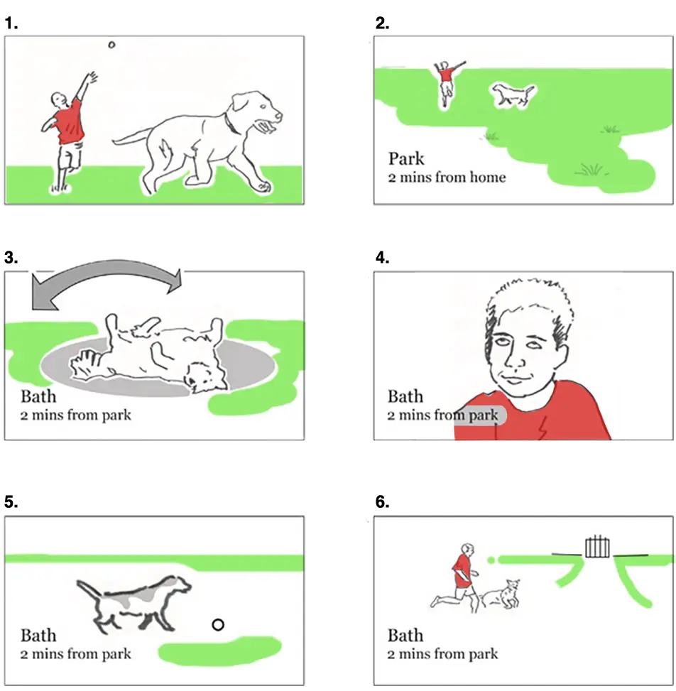
Launch ad storyboard – Jack & Bouncer

“Bouncer gets really moody if you crowd him”

No one understands Bouncer like his best friend Jack. And when a claustrophobic dog needs more space there’s nothing for it but to nag Mum and Dad to move nearer a park.

Google Brand ReImagined events

Google Brand ReImagined events

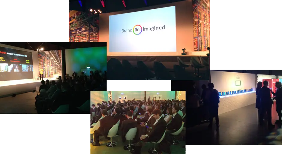
For Brand Fuel I art directed and designed many of the digital elements of the Google Brand ReImagined events in Amsterdam, Milan and Madrid. These took place across Europe and featured multiple speakers presenting to an invited audience of local business executives. The intention was to show them the changing nature of advertising and how Google tools can help them create a brand presence in non-traditional media spaces.

The role was both hands-on and client-facing. I developed ideas working with the event Producer, frequently presented to the client team and was hands-on directing a team of developers. A large part of my work for the event was designing the event experience of a second-screen app. This gave contextual information about the speakers, enabled delegates to share to their social channels and save notes; all from within the app. In addition, the app always reflected and complimented the experience within the room, sometimes showing the same content on the main screens (e.g. an animated countdown prior to the event start), sometimes becoming passive so as not to distract (screensaver mode).

In the end, a functional, personalised experience of the event was created and all the content that delegates saved to the app was then delivered back to their inbox as a unique record of their day.